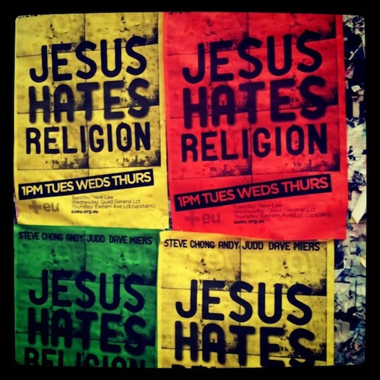
The Jesus Hates Religion mission at Sydney Uni has kicked off well. I appreciate the many who have partnered in prayer. Keep praying! This post isn’t actually about the mission. I wanted to share the posters they have on the notice boards around the campus:

Here’s 4 things I like about them.
- They look good. Striking.
- I like the font
- The important information is massive. The rest of the content is minimal, but sufficient.
- They’ve got 4 posters displayed together, the 3 colours used in the arrangements are good. 4 would have been too many, 2 not enough.
I haven’t really written anything profound here. But hopefully it might provide some design inspiration.
The pic originally appeared here and this is the app that grunged it up.

The color scheme does look Jamaican though, like there’s going to be plenty of rastafarian people there…
yah mun